The Lyric put on a solid performance of Fiddler on the Roof. It was impressive to see older members of cast having such strong parts— and they delivered. With great numbers, comedic timing, and difficult situations, it was a strong performance with a light beginning and emotional ending. I felt the gravity of such situations is not as relate-able this day in age, but it still provided a healthy amount of emotional investment.
See more.
John Preece proved to be a master with Tevya. With so much experience, he added the right amount of nuances to the character, making me really believe him and his situation. The comedic touches, while perhaps feeling a tad out of place, gave the play an extra edge in enjoyment.
The first act was energetic, lighthearted, and fun. It had a lot of energy and drew the viewers in. The transition to the second act felt a bit jolting, both in its change in feeling and the fact that its execution and screenplay did not feel as consistent. Nevertheless, the gravity of the situation is still communicated and felt; Tevya finally draws a line that is consistent with "Tradition".
"Matchmaker, Matchmaker" featured harmonizing vocals from the three eldest daughters and synchronized mop play. The first Christian dance scene was intricate and fun. The wedding ceremony "Sunrise, Sunset" provided relaxing backing vocals. The "Do You Love Me?" showed off Golda's chops and made the viewer appreciate and understand their relationship.
The front lighting of the set was simply too strong and contrasty. Yes, the viewer needs to focus on the character, but it somewhat distracted from the ambiance; especially because the sets themselves looked to be detailed. The flow from scene to scene, however, was done seamlessly, with several scenes beginning before it was finished.
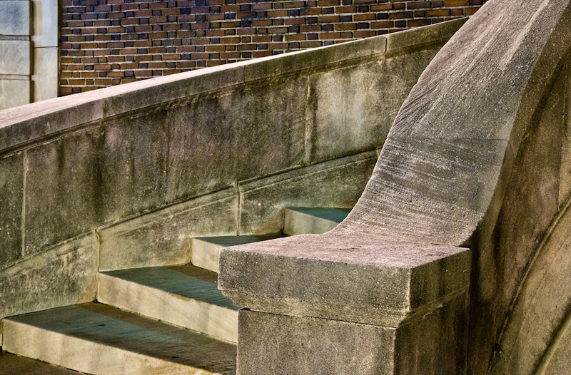
This two dimensional scene of a building side has some interesting variety, but lacks any emotional reaction. The textures, swirly patterns, bare spots, and vertical color gradient keep some attention and do show some beauty that you may walk by every day. The window appears relatively small and misaligned, which may add some tension.
See more.
The moire of the screen is a little distracting. The detail of the scene could have been brought out some more, perhaps if the sun was more to the side. Especially since there is no front to back depth, it relies on the texture detail and composition. The layout of the bare spots are not the most interesting, and I'd like to see more of the wall.
A more three dimensional scene that is captured in a somewhat flat perspective. In the same vein as the previous photo, its intent is bring light to the parts of the city that we pass every day.
See more.
I enjoy this composition much more for its use of lines that separate the distinctly different textures. The lines all seem to flow out of the upper right, and move across the image in different directions. The mix of street light temperatures adds some pleasing colors in the shadows.
A larger aperture would make the sharpness more even added to the flat projection of the scene.
An low perspective view of the Houston airport. The angle is compelling, as the giant void towers over the miniscule people, waiting to suck them up. For reference, a more standard view of the scene can be found here.
See more.
The perspective and choice of lens in this photograph make this a unique view. Waiting for the people to clear the column and let in a shaft of light on the walkway was a good choice, but the processing leaves something to be desired.
The center of the photo is so bright that the eye is just stuck there. Maybe it ventures off to the bright windows, but that's it. The rest of the image does not have enough local contrast to entice the viewer. It's more or less the same shade of sepia. The people at the bottom are compelling, but lost in the shadows. The less interesting top left part of the photograph takes up more than desired.
Some burning of the main ceiling or brightening of the rest of the image would really help. Adding some contrast to the bottom corner of the image, especially the reflections on the walkway would be well advised.
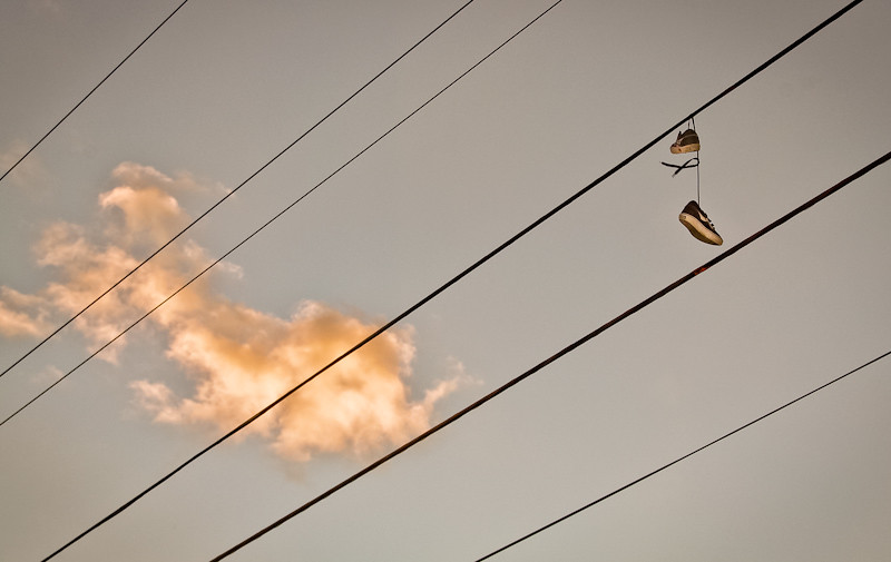
Shoes that flew a little too close to power lines. This photograph creates a bit more of a narrative than the others in this set, with its dangling shoes, wind, and red stain beneath them.
See more.
I like the subject. And the timing of the wind and an cloud. It lets us play a bit of "what does this cloud look like?" Between a fish or a whale, or a star trek ship, it's a tad unfortunate our imagination cannot tie it to the rest of the photograph, no matter how hard we try.
The non-shoe'd powerlines, while probably necessary in the shot, do nothing for me. The orange editing is distracting and too saturated, but could've been nicely complimented with a slight orange gradient.
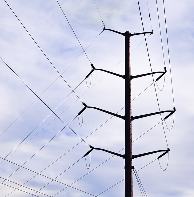
Now here's a shot that has potential (that was an electric joke). There is some nice repetition, geometry, and some rustic brown peeking through. It's another mundane part of our lives that we pass everyday.
See more.
It's high contrast and dark blacks creates a graphic feel, whether it's fitting or not (though the oversharpening is certainly not). The sky is rather uninteresting and detracts from the form. The power lines in the lower left are also bothersome. And despite being horizon corrected, the composition makes it feel that it is leaning to the right.
"Always Spring", I'm From Barelona (2011 Sweden Pop)
This song just makes me feel all warm and fuzzy inside. It's just so upbeat and catchy. The chords and rhythm they use with the piano and vocals are great and well delivered. It successfully stays under the way too happy threshold, making it a bit amusing. When they add the word repetition of lyrics beginning after the second chorus, it's even better. That, and the the trumpet accents at the end of the song show are appreciated.
And the video is hilarious.
See more.
The backing music during the chorus with the bass line is kind of lame. It's quite repetitive song and the lyrics are a bit lame. With the coda and trumpet line coming in, I really wanted the stache dude to hold the note.
"Dancando No Paraiso", Hiromi Uehara (2003 Japan Jazz)
Such vigor. Hiromi really takes command of the piano and pumps us full of energy. There is a lot of precision, you can really appreciate when she dances between her hard authoritative notes and delicate soft notes. The transitions are kept varied and smooth, from abrupt tempo shifts, to gradual crescendos. But this song wouldn't be great without the excellent performance of both the drummer and the bassist. The bass moves just as fast at points with some intricate work. The drummer switches from the soft and hard sessions right on point, and keeps with interesting fills. His duet with Hiromi after his solo is an absolute joy to me.
See more.
The only low point for me is the beginning of the drum solo section. It's absolutely necessary to have a break in this long of a furious song, but it's not as spectacular as the rest of the song.
"Your Darkest Hour", Evergrey (2003 Sweden Metal-Progressive)
This is one powerful and uplifting song. Not only are the riffs and vocals damn catchy, there are beautiful arrangements with the piano, and they do the angelic female interlude right (cough Light of Day, Day of Darkness from Green Carnation). The drumming is fairly well varied.
See more.
The first verse is pretty crappy, musically and vocally. The leading keyboard sound isn't horribly bad like most songs, but I still don't find it pleasing, for the most part (though the end is decent). The structure isn't bad, although it is approaching a longer song which would definitely require more variation. The interlude is good enough to break it up.
A dynamic jazzy song with many shifting moods, beautiful melodies, and angelic female vocals. The interplay between the vocals and all of instruments are excellent, my favorite being the violin. The guitarist doesn't show off and jumps back and forth from the lead lines to adding texture. Throughout the song, both the drums and bass do a great job. The fills are dynamic and shift with the moods of the song, and the bass lines are always interesting and varied.
After a soft introduction, the tempo picks up with the drum and bass backing the tasteful melodic guitar lines. The pleasant vocals come in with a nice jazzy section subtle piano accents. The violin slowly comes in the background and builds before taking over the song until it takes over with gorgeous solo. It starts out slow, but it builds up with some wonderful tones and variety of textures. After the synthesizer solo, the coda features with the vocals harmonizing with the lead melody.
See more.
Cheesy synthesizer in the beginning and a few other parts, like the aching solo. In a few sections, the vocals struggle a tad bit, and some melodies feel forced and out of place.
"Pure", Mors Principium Est (2005 Finland Metal-Death)
Finally a song from a band that stands out a bit in this genre. Aside from the headbangingly brutal riffs and drumming punching you in the face, sprinkled throughout are melodic female vocals and sampled drums that serve a nice break. There are some very catchy melodic riffs with subtle accented keyboard. The drummer of course does a good job with the hi-hat/cymbal fills and double bass, especially during the softer and slower sections.
The tone of the guitars are nice and thick, and the harsh vocals do a good job of matching.
The harsh vocals are filled with a good amount of emotion. They aren't supposed to be understood, but rather thought of as an instrument like in the last song. I've thrown up a video with lyrics for the curious. The song is about the inhumane things done in the name of God, and the regret that followed.
See more.
The lyrics are a tad repetitive. Some of the breaks and transitions feel a tad abrupt. Not so hot on the section after the bridge. The solo is a bit weak, and the riff underneath it is just bad.
This classic film shows itself to be a powerful and moving film about coping with old age. I was pleasantly surprised with the amount of humor and good comedic timing of this old film. It manages to maintain a level of easygoingness, despite the gravity of the situation: an elderly couple whose home forecloses and is forced to be split up between their children. This film is particularly relevant now, with the economy and retirement of the baby boomers. It's both relieving yet sad that the general feeling of taking in our aging parents hasn't appeared to change much in 60 years.
We see the couple split up since each of their five children came up with excuses not being able to take both. It is easy to relate to the children, who try to live their middle-class lives and deal with the complications from their parents. However, the film can't help but make you feel sympathy for the awkward parents as they struggle to live on without their better half. While the children are created to be fairly stereotypical, the parents are crafted in a lovable aloof way. Beulah Bondi, as Lucy, gives us some real gems:
View comments with spoilers.
One great scene is when Lucy finds the letter about the nursing home. At this point, I believe she has begun to feel her own burden as well as lose hope for the future of her and her husband. In a feat of charity, she suggests it to the son before he gets a chance to kick her out. But it's not all heavy and depressing, she manages to throw him an emotional curve-ball and tell him that he was always her favorite: classic.
My favorite is the bridge game lesson, where her daughter thought she successfully kept her mother away. After we experience Lucy's incessant rocking awkwardly and visibly annoy all of the guests, she gets a phone call from her husband. At first, her stereotypical loud talking is more unpleasant than the rocking and the crowd looks at her in disgust. But as their conversation unfolds, both the guests and the audience begin to understand the loving bonds that been stretched beyond comfort. This scene makes the us all feel that not only are we are now intruding on her conversation, but cognizant of what is happening to their well-being. It's powerful by that it not only makes us feel sympathy after feeling annoyed, but also lets us feel the same thing that the guests in the movie feel.
The film's powerful delivery is owed largely in part to the great pacing. Not only is the comedic timing well done, but each scene gives us ample time to feel each emotion and feel out each situation without being slow moving. While the bittersweet climax and ending surely isn't what everyone wanted, it serves as a poignant reminder to issues many of us will deal with.
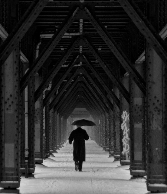
This photo feels cold and lonely. A dark figure, shielded by the umbrella, walking into the distance past the never-ending beams.
The figure itself is an exception. The motion blur and muted contrast/lack of white add to the feeling of departure, of the fleetingness of moments. The symmetry and framing of the beams and support connections to the top, with the shadows of the poles on the ground add both a nice natural frame and a pleasing repetition. The fog and snow that gradually hide the repetitive structures creates a nice gradient. The white snow on the ground adds an excellent mirror to the dark structure at the top of the frame. The processing of the photo reflects the feelings of the subject and composition well.
See more.
Everything is relatively, although not tack sharp in this frame. I would have liked to see some of the surroundings or footprints more detailed.
There are some minor elements of that distract the eye. The alignment of the bottom of the support beams, especially in the foreground, the only slight blurring of the figure, the figure's long black coat, and the high contrast graffiti. While the graffiti can be a distracting element to the eye, it gives good context to the time period, and contrasts well with the old time feel. Coupled with the motion blur of the figure, it gives a relative feeling of permanence. But my eye is still naturally drawn to it.
The bliss captured in this moment is priceless: a father bonding with his daughter. There is a lot of great positive emotion captured in this: it feels like I am the one swinging the child around in a circle. I can hear the laughter and screams of joy.
The child is sharp and focused, while the background is blurred just enough to indicate the motion. A longer exposure could have added to the dizzying effect. The lighting appears soft and cloudy, allowing me to focus on the expressive liveliness and emotion.
See more.
The composition and tilt add to the feeling of motion and that we are spinning the girl. But the longer I look at it, the more I become aware that I am at chest level: the location of the hands in the frame, the girl looking up, etc. Cropping some of the upper left of could alleviate this, but too much will throw off the balance of the light sky.
Typically I find I like expressive photos in monochrome, but the slight desaturated look works out well here as the red and green are not too much, and are happy colors nonetheless.
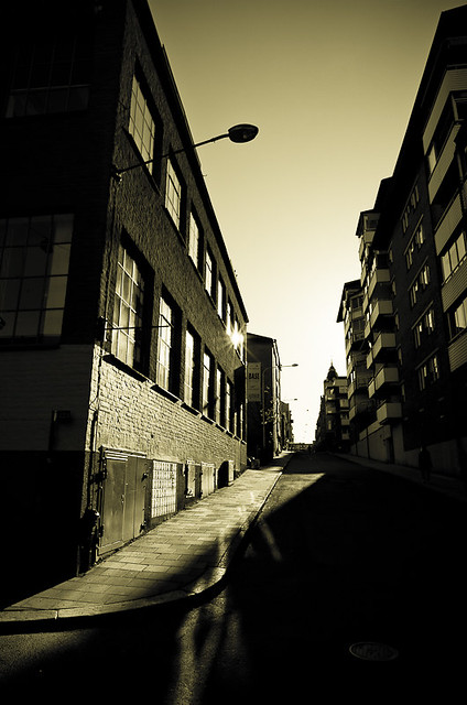
This alley has a bit of a classy and timeless feel, as if it was taken any decade. The processing does a good job amplifying this. The lighted pathway and reflections off the window do a good job of leading my eyes. The reflections particularly are unique and grabbing. The gradient in the sky adds a nice soft feel.
See more.
But then my eyes are led to the center of the image and stop. They are then drawn back towards the bright left side of the image and that's it. The repetition in this photo is a strong point that could be amplified. The windows on the left, the balconies/windows on the right, and the subtle street lamps. I feel the right side is buried a bit too much in the darkness in comparison to the left, yet has more interesting structures and patterns. Of course, overdoing it would be unnatural. The bottom right is all black to me and throws off the balance. A bit of shadow detail there would let me feel more at ease and less like a 3 legged table. The perspective and leaning buildings, coupled with the perceived thin aspect ratio, add to this uneasiness.
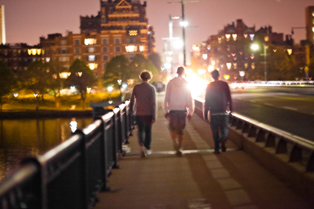
This photo reminds me of young weekend nights back in school. Looking back on those days, all you remember is the feeling, with no details. This photo captures that in its blurry simplicity. The lights in the background windows and water are great. Motion blur and lack of sharpness mimics the feeling that you get from looking back on those lazy days that blend together.
See more.
Colors and tint don't add much in my eyes: I'd like to see monochrome.
Lack of shadows on the subjects is disappointing and could have been interesting.
I feel the leading lines actually distract a bit. The right and bottom could be cropped out some as I don't feel the center-ish subjects works best. Also, the darker vertical pole is distracting.
This photo reminds me of how the job of the President isn't always exalting. It makes me think of him addressing the public after some horrible event, out of his control.
The capture of the rain and the umbrella is brilliant with the backlighting, silhouetting Obama and edge lighting the crowd. Leading staircase is lighted wonderfully. The stadium lights add to the feeling that all eyes are on him.
See more.
However, I feel the composition could be improved: the space on right is distracting and the center composition is okay. The colors from the flare and the crowd are distracting. The stadium lights and forest background aren't the most aesthetic, either.
A close up view of a large grasshopper. This shot places the skyscraper hotel against the grasshopper's own highrise. The motion blur and pose almost look like it's falling. There is a nice amount of detail on the insect, good colors, and surprisingly smooth bokeh for a point and shoot. This is the first picture I've taken that I really liked.
See more.
What sticks out to me is the composition. The creature is centered and takes up a large amount of the real estate. Eyes are drawn immediately there and then to the skyscraper. But the rest just seems a bit busy. I'd like it if the strand and grasshopper were smaller. The diagonal composition could be better. It's tilted a bit too much, I think rotated clockwise a bit would help the slight jarring effect. The juxtaposition isn't very strong. The focus is off the head of the grasshopper, and the picture didn't obtain the 3D effect outside of the in-detail section.
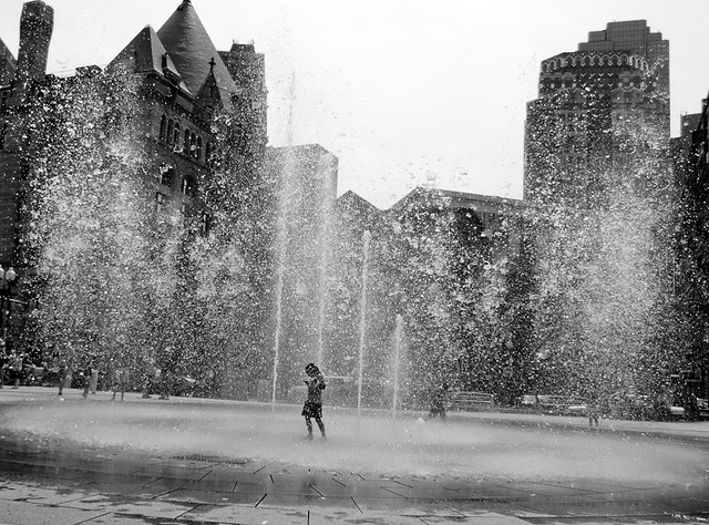
I feel like the little boy in this photo is commanding the water and causing the ground to shake. The fast shutter speed's frozen water and tilt does a great job of adding this feeling of power. I like how the cracked patterned pavement is hidden when you get close to the young boy. The shadow and light on the buildings, especially on the top left, is pleasing.
See more.
The boy is close to center, but not quite, though I think the tilt and buildings balance it out a bit. I'd still like to see other compositions, and a stronger tilt.
The middle-gray dominates the photograph, so adding contrast in the non-sky areas could help add some dynamic to the shot. The issue is the water against the sky, but that could be brought out separately.
This photo captures the glory and size of the Mayan pyramid El Castillo, with its dramatic sky and close perspective. The sky is dramatic and the clouds almost look like smoke, coming off the back of the pyramid. The detail on the structure is intricate, with lots of details captured. The harsh sun reveals the textures quite well.
See more.
I feel like a better perspective could've been gotten. To get the edge of the stairs, and the edge of the right side of the pyramid. I think a wider aspect ratio would've shown the massiveness better. More room on the top might be interesting, but the pyramid being so close to the top might be adding to the massive feeling.
I think more interesting shadows might've come out one the sun was less face on with the pyramid. Instead, only one sliver is really in shadows. The sky is a bit too overcooked, with such deep blacks. The stairs lose their 3D effect near the top and look like a slide.
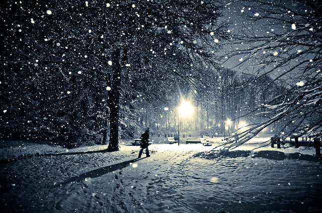
It almost looks like it is in a snow globe that was shaken. The trees, the path, the snow, etc. all give a bit of a swirling feeling. The soft subject shadowy figure adds an element of mystery, and is complimented by the leading line shadow and the warm light and cold background. The depth of field is wide enough to reveal the interesting details in the background while keeping the foreground snowflakes larger to add variety. The flash slowed the snowflakes wonderfully, and the shutter speed's blurring of the man adds to the mystery of the photograph. The noise was cleaned up pretty well for ISO 6400.
See more.
The snow is dominating the upper left quadrant of the photo with, both in mass and frequency. The branches on the right, particularly the low sticking out ones, covers up a bit of the landscape and the second figure. In one sense, covering up that figure gives the dark figure dominance and also continues the curved line of footsteps from the bottom.
This iteration is much improved over the previous one here, with the toning and vignetting drawing the viewer in to the center of interest more. The vignettes
The crispness and detail of the shot are eye-catching and provide the initial bite. The monochrome processing focuses my eye onto the texture and shadows created by my flash.
The tip and other vertical blade do take away attention from the clean similarly oriented grass, but I like this distraction. It breaks up the expected, and the shadows with the grass form a nice contrasting lines and keep my eyes lingering longer.
See more.
I did wish I had more room on the right to give the vertical blade some more space, and perhaps some more buttery smooth bokeh which congregates mostly in the upper left corner.
The two characters, Reed McAllister (Paul Morella) and Elena Carson (Deborah Hazlett), are former lovers who cross paths on their layovers. Snow causes delay after delay, and the strangers' conversation traverse the superficial small talk, amusing reminiscing, and awkward recollections.
Interspersed are well placed lines of wit and throwbacks to college romance of their time, of which not everyone can relate to. As the delays pile up, how much will they open up to each other? It's one of those rare opportunities, usually just a thought experiment, where you can go back with your ex-significant other and say or ask anything with no consequence. It's not like anything you say will be of any real consequence.
The two characters, on the surface, appear to have drifted down different paths with the decades that separated them. In a feat of discovery, they uncovered their misunderstandings and misconceptions about each other and their relationship. Slowly they begin to trust themselves with secrets long past and deep in their lives.
There is a wee air of fabrication with the unwinding of the story, and the airport feel just wasn't there, but the director made the right choice in focusing on the characters. I couldn't help but get wrapped up in the emotion and messages. The play felt intimate with one set and two actors, who did a great job. The concept itself is great, and the execution is good (though lacking a certain something), but the ending was surprisingly well suited.
The characters eventually realize that there isn’t much point in focusing on the past, so they move to their imperfect lives and connect on a new level. Once the snow blanket is lifted, the magic is gone once again as they revert to the usual formalities.
The ending hits home for me. They talk, they make plans, but never actually show up. They are strangers once again.


